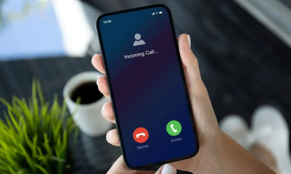
Google tests a new Phone app design for Android, featuring dedicated accept and reject buttons. Discover how this update could simplify call management for millions of users.
As I stand in the bustling halls of Google’s Mountain View headquarters, there’s a palpable sense of excitement in the air. The tech giant is on the verge of rolling out a significant update to its Phone app, a change that could affect millions of Android users worldwide. This redesign, currently in testing, marks a shift towards a more intuitive call interface, drawing inspiration from the iPhone’s familiar layout.
New Android Call Management
The Google Phone app, a staple on Android devices, is poised for a major facelift. According to sources within the company, the upcoming version 145.0.672690850 introduces a revamped incoming call screen that’s set to revolutionize how users interact with their phones during incoming calls.
We’re always looking for ways to improve user experience,” says Sarah Chen, a UX designer at Google, as she demonstrates the new interface. This update aims to make call management more intuitive and accessible for everyone.
Goodbye Swipe, Hello Buttons
The most striking change in this update is the replacement of the current swipe-to-answer method with dedicated accept and reject buttons. This shift brings the Google Phone app more in line with iOS and other Android manufacturers like Samsung.
Chen explains, “Our research showed that many users, especially those switching from other platforms, found the swipe gesture less intuitive. The new button layout provides clear, visual cues for action.”
The new interface features a green accept button on the right and a red reject button on the left. This layout, while similar to the iPhone’s, differs slightly from Samsung’s approach, which reverses the button positions.

Color-Coding for Quick Decision Making
As I observe the new interface in action, it’s clear that the color-coding of the buttons serves a crucial purpose. In high-stress or busy situations, users need to make quick decisions,” Chen points out. “The green and red buttons provide instant visual feedback, allowing for faster response times.”
This color scheme is a universal language in user interface design, with green typically signifying positive actions and red indicating negative or canceling actions.
Enhanced Messaging Options
Another noteworthy addition to the interface is the prominent “Message” option above the phone button. This feature allows users to quickly send a text message to the caller if they’re unable to answer.
“We understand that sometimes you can’t take a call but want to acknowledge it,” Chen says. “This feature makes it easier to maintain communication even when you can’t talk.”
As with many Google updates, this new interface is being rolled out gradually. The company is using a server-side toggle to control its distribution, meaning that even users with the latest app version might not see the changes immediately.
We’re starting with a small test group,” explains Tom Rodriguez, a product manager for the Phone app. “This allows us to gather real-world feedback and make any necessary adjustments before a wider release.”
As news of the update spreads, Android users are expressing mixed reactions. Sarah Thompson, a long-time Android user I spoke with outside the Google campus, is excited about the change. “I’ve always found the swipe gesture a bit finicky,” she admits. “Having clear buttons to tap will make things so much easier, especially when I’m in a hurry.”
On the other hand, Mark Johnson, another Android enthusiast, is more cautious. “I’ve gotten used to the swipe method,” he says. “It might take some time to adjust to the new layout, but I’m willing to give it a try if it improves overall usability.”
As Google continues to refine its Phone app, this update represents a significant step towards harmonizing the Android call experience with other popular platforms. It’s a move that could potentially reduce the learning curve for users switching between different devices.
Rodriguez hints at future developments, stating, “This is just the beginning. We’re constantly looking at ways to enhance the calling experience on Android devices. Stay tuned for more updates in the coming months.”
Google’s decision to revamp its Phone app interface marks a pivotal moment in Android’s evolution. By adopting a more universally recognized call management layout, Google is prioritizing user-friendliness and accessibility. As the update rolls out to more users in the coming weeks, it will be interesting to see how this change impacts the Android ecosystem and whether it sets a new standard for call interfaces across all platforms.


Add Comment