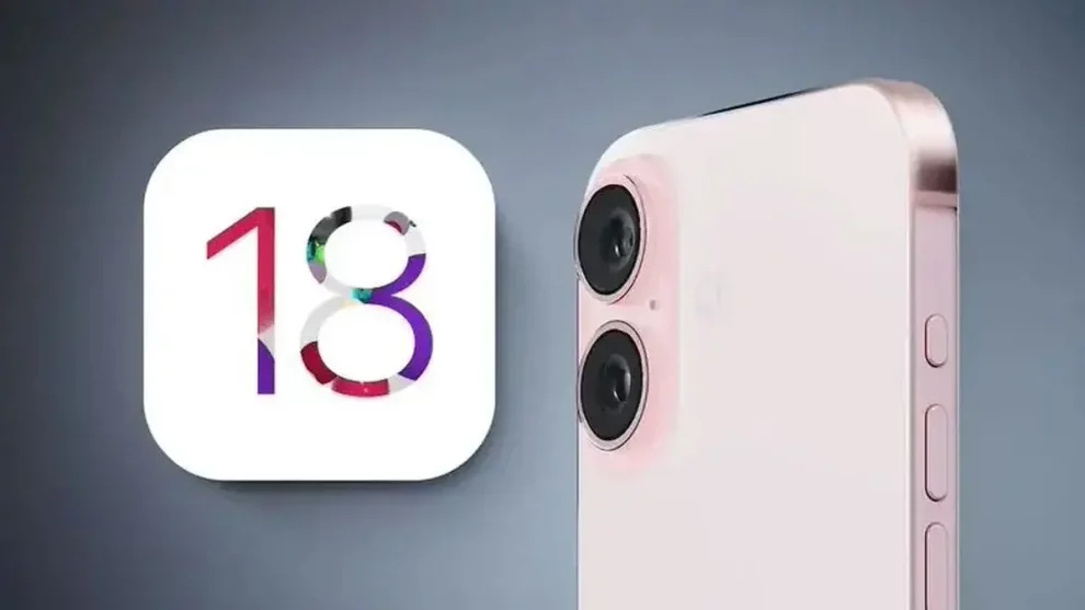
For iPhone users who value a clean, meticulously organized home screen layout, the inability to create blank spaces between app icons has long been a source of frustration. While Apple’s iOS 18 introduces several new features and enhancements, the coveted ability to customize the home screen with empty spaces sadly remains absent.
Apple’s Grid-Based Layout Constraints
At the heart of this limitation lies Apple’s decision to enforce a grid-based layout for the iPhone home screen. This streamlined approach ensures a consistent user experience across devices and simplifies app organization. However, it also constrains users who desire a more personalized aesthetic with empty spaces strategically placed for a cleaner look or to better showcase certain app icons or widgets.
The Risks of Third-Party Workarounds
In the absence of an official solution from Apple, some users may be tempted to explore third-party workarounds or the concept of jailbreaking their devices. However, these approaches often come with significant risks and potential consequences.
Third-Party Apps: There are apps available that claim to create blank spaces on the home screen. However, many of these rely on visual trickery or require intrusive access to your device, potentially compromising security and stability. Thoroughly researching and vetting any third-party app is crucial before installing it.
Jailbreaking: Jailbreaking removes Apple’s software restrictions, theoretically allowing for deeper customization, including the ability to create blank spaces. However, this process also exposes your device to vulnerabilities, malware, and exploits. Additionally, a jailbroken iPhone may lose access to future software updates and features from Apple.
Considering the potential security risks and the potential loss of access to future iOS updates, these workarounds are generally not recommended.

Alternative Solutions for a More Organized Home Screen
While the dream of creating blank spaces remains elusive in iOS 18, there are alternative strategies iPhone users can employ to achieve a more organized and visually appealing home screen layout:
Embrace Folders: Grouping similar apps into folders not only declutters your home screen but also allows for better categorization based on app type or usage frequency.
Leverage Widgets: Widgets offer a dynamic way to personalize your home screen and access information at a glance. Experiment with widget placement to fill empty areas and add functionality.
Minimalist Wallpaper: A clean, clutter-free wallpaper can create the illusion of more space on your home screen while complementing your app icons and overall aesthetic.
A Hopeful Look Ahead
As Apple continues to refine and update iOS, future iterations may introduce more advanced home screen customization options, potentially addressing the long-standing desire for blank spaces. Keeping an eye on official Apple announcements and software updates is crucial for those seeking greater personalization options.
While the current state of iOS 18 may disappoint users craving a more curated home screen experience, there are still ways to achieve a well-organized and visually pleasing layout. By leveraging folders, widgets, and minimalist wallpapers, iPhone users can create a home screen that reflects their personal style and optimizes their workflow – even if those coveted blank spaces remain out of reach for now.


Add Comment