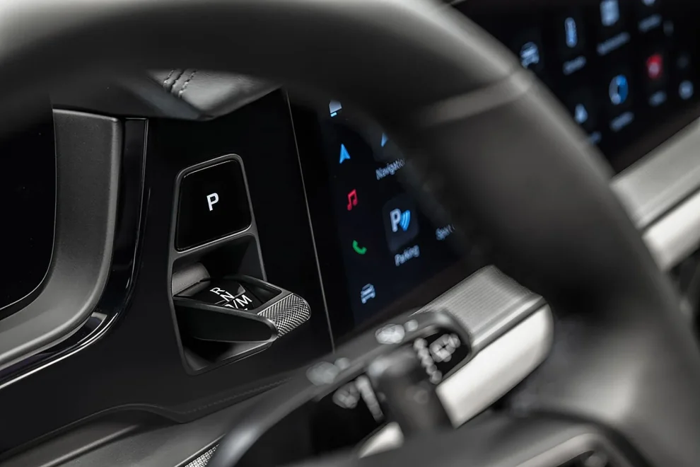
Major tech and automotive companies are reintroducing physical buttons to their products, moving away from the ubiquitous touchscreens that have dominated the industry for years. This shift marks a return to tactile interfaces, driven by user demand for improved functionality and safety.
As I walk through the bustling halls of the Consumer Electronics Show in Las Vegas, it’s clear that a change is in the air. Amidst the dazzling displays of cutting-edge technology, there’s a palpable sense of nostalgia. Tech giants and car manufacturers alike are showcasing products that harken back to a simpler time – a time when physical buttons reigned supreme.
Sam Calisch, Chief Executive of Copper, explains the rationale behind this unexpected trend: “Now that touch screens are the cheapest option, they’re being deployed everywhere, even in places they don’t belong.” This cost-driven approach, it seems, has led to a user experience that’s less than ideal in many situations.
One of the most significant areas where this shift is occurring is in the automotive sector. As I observe the latest car models on display, I notice a marked increase in physical controls for essential functions like climate control and audio systems.
Matthew Avery, director of strategic development at the European New Car Assessment Program, emphasizes the safety implications of this change. “The overuse of touchscreens is an industry-wide problem,” he tells me. Almost every vehicle-maker moving key controls onto central touchscreens, obliging drivers to take their eyes off the road and raising the risk of distraction crashes.
This concern has led to concrete changes in safety standards. The European New Car Assessment Program now requires vehicles to be equipped with physical buttons to achieve the highest five-star safety rating.
As I speak with attendees at the show, it becomes clear that this shift is not just about safety – it’s about user experience. Many express frustration with touchscreen interfaces in various devices, from smartphones to home appliances.
One attendee, Sarah Thompson, a software engineer from San Francisco, shares her experience: “I recently bought a high-tech induction stove with touch controls. It looks sleek, but when I’m cooking and my hands are wet or greasy, it’s a nightmare to use. I miss the reliability of physical knobs.”
Interestingly, some of the biggest names in tech are at the forefront of this movement. Apple, long known for its minimalist design philosophy, has introduced new physical controls in its latest iPhone models.
As I handle the new iPhone 16, I notice the addition of an ‘action’ button and a touch bar for camera controls. An Apple representative explains, “We’re always looking for ways to improve user experience. Sometimes, that means revisiting design elements that have proven their worth over time.”
This approach isn’t limited to smartphones. In 2021, Apple reintroduced physical function keys to its MacBook Pro line, replacing the controversial touch bar. The company stated that this change “brought back the familiar, tactical feel of mechanical keys that pro users love.
Automotive Industry Follows Suit
Car manufacturers are also jumping on the bandwagon. As I tour the automotive section of the show, I see representatives from Volkswagen and BMW showcasing their latest models with increased physical controls.
Patrick McKenna, head of product and marketing at MINI USA, walks me through their new design philosophy: “Our goal is to allow complete control without the driver having to take their eyes off the road. We’re achieving this through a combination of physical controls, like a scroll wheel on the steering wheel, and voice-activated commands.”
As the day at the Consumer Electronics Show winds down, it’s clear that the tech industry is at a crossroads. The push for ever-sleeker, more minimalist designs is being balanced against the practical needs of users.
Jay Capsian Kang’s 2022 New York Times opinion piece resonates with many attendees I speak with: “I can think of no better way of describing the frustration of the modern consumer than buying a car with a feature that makes you less safe, doesn’t improve your driving experience in any meaningful way, saves the manufacturer money and gets sold to you as some necessary advance in connectivity.
This sentiment seems to be driving the industry’s reconsideration of interface design. As technology becomes more integrated into our daily lives, there’s a growing recognition that innovation must serve usability, not the other way around.
The return of physical buttons in tech and automotive design represents a significant shift in the industry’s approach to user interface. Driven by safety concerns, user preferences, and a desire for improved functionality, this trend suggests a future where cutting-edge technology and time-tested design elements coexist harmoniously. As we move forward, it will be fascinating to see how companies continue to balance innovation with usability, potentially ushering in a new era of intuitive, user-friendly design.


Add Comment